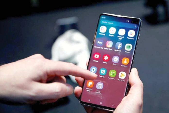
To transform a business idea into a genuinely used service, you need an App with a functional, appealing and intuitive design. From the use of colors to the “2 taps” rule, here are the expert’s suggestions for a Mobile User Experience capable of capturing the attention of users and making the browsing experience pleasant from the smartphone Millions of Apps now crowd the stores, continuously offering innovative services. Distinguishing yourself has become increasingly difficult.
In this context, the Design of the Mobile User Experience can make the difference: you need to capture the attention of people, old and new users, but without neglecting the ease of use of the App and forgetting to take advantage of recent trends. And innovations in User Interaction & Design (for example, the introduction of “force touch”). The design phase is, therefore, fundamental for success. Here are ten tips to keep in mind to create an App or a Mobile Website with an optimal Mobile User Experience.
Mobile User Experience Means Simplicity: Take The Strain Out On Your Users
Mobile predicts activities on the go, by definition. Users use the App while doing other things or commuting from home to the office to go to work. Maybe they’ll find time to make an online purchase, wire transfer, or pay a bill. And at that moment, that’s for sure; they will seek maximum simplicity. This aspect of the Mobile User Experience is fundamental. Marissa Mayer, the Yahoo CEO, created the “two taps” rule for Yahoo Apps: once you are in the App, you need to simplify if you are more than two taps away from doing anything you want to do. Always try to reduce users’ effort to make sense of your App or its features.
Objectives Drive A Design
The Design must be “functional”, considering we are talking about small screens, such as smartphones. For example, the Design of the graphical interface must ensure that every time your App displays a message (for example, a pop-up) asking for input from the user (such as, for example, the request to enter their phone number), there is all the information necessary to ensure that the user himself can decide on what he should or want to do.
Otherwise, the user will be lost and unable to make a quick decision. And this is undoubtedly a drag in terms of Usability. This aspect is crucial for mobile banking apps where the dispositive actions and the forms to fill are innumerable. Don’t forget that Design is not just about looking special or unique. Design is about making a fantastic “user experience”. And this means that clarity in what the user has to do is a necessary condition.
A “Thumb-Friendly” App
There are three ways to use a smartphone. Users:
- they use only one hand and navigate with their thumb;
- they use two hands and navigate with both thumbs;
- they use one hand to hold the smartphone and use the index finger of the opposite hand
We also add that some users touch the screen with only the tip of their finger, while others use the entire fingertip. Consequently, it is practically impossible to define in advance exactly how many pixels should be dedicated to making your button “clickable”, but, in any case, Apple recommends creating buttons with a minimum size: of 44 × 44 pixels. This measure is not a fundamental and non-derogable law; on the contrary. But the size of the clickable areas must always be considered since the finger is necessarily more comprehensive than a mouse pointer.
Give Feedback To Users, Don’t Abandon Them
Another tip to consider in the Design of the Mobile User Experience is not to forget the users when your App is performing some operation in the background. A classic example is when your system has to load data or perform complex functions. Mobile is not the desktop, and the user tends not to want to wait, so use the time you need wisely and make it interesting for users. Avoid tedious and unnecessary blank screens. There should be an immediate response when a user stops, swipes, or clicks a physical button. If something needs to take a while to load, show users a loading bar (or something even more interesting) so they know they’re about to get something (fast).
Alternatively, you can use an animation that keeps users “engaged” in extra entertainment. Whatever solution you choose, in any case, make sure that every interaction with users has an answer. It is common to find generic error messages and the usual “an error has occurred”. Again, the user feels abandoned because he doesn’t know exactly what he did wrong, so he can lose his temper and leave the process. Texts such as “An error has occurred: the email address was not recognized”, for example, are preferable. Explaining which error occurred and possibly offering solutions to fix it allows you to guide the user and not lose it before conversion.
Don’t Fill The Screen With Information
Just because the pixels are getting smaller doesn’t mean you can make the font smaller and fill the screen with text. More content doesn’t necessarily mean more information. On the contrary, this brings us back to the basics: understand your goal, orient development and Design to satisfy it, and reduce any other friction. Also, test your App on the devices you have developed to ensure that the critical aspects are elementary to view.
Real devices to understand how the content scales on different devices with different resolutions (with Crowd Testing techniques, it is possible to perform these tests quickly and effectively). The text should be at least 11 points, you should have suitable space between letters and lines, and the user should never zoom in to understand what they should be doing or to understand what they are reading ( 2-finger zoom is very burdensome for the user, typically he has to change the grip of the smartphone and necessarily use two hands while in motion).
Use Gestures Wisely
Gestures help you keep confusion to a minimum, are intuitive for users of the most advanced smartphones and make the user experience more dynamic and fun. Study the most popular interfaces and the most common UI patterns so that you can learn which are the gestures that your target users typically appreciate. The gestures that millennials are familiar with differ from those that younger and more savvy users use. To decide which move to use, think about your target users, study your product well and choose the ones that make the most sense for your App.
Use High-Resolution Images
The number of screen resolutions available in the smartphone market is constantly expanding. It is now a continuum from a few inches to enormous dimensions. Consequently, you always start with a Design for retina devices, i.e. screens with high resolution and with a very high pixel density and then scale accordingly. Use vector images that will automatically mount on every screen, so ensure you always have quality images. Again, a multi-device test can be instrumental.
Texture: Don’t Change Colors Often
What if you are changing the color or font of a screen or paragraph? Do it consciously and with good reason. Colors are a potent tool in terms of design organization: they help you direct the user’s attention and establish a visual hierarchy. For example, suppose you present your user with a choice of 3 buttons to press, the first of a very bright orange, the second of a slightly softer color, such as the same orange but a little less bright, and the third of a pale-peach color. In that case, you report that the first choice is the most extreme while the last is the mildest. Too many changes to colors or fonts reduce the impact of each action and confuse the user. As a result, make a few changes and make sure those changes have a significant visual impact.
Organize The Call-2-Actions Appropriately
Make clicking the right button as easy as possible. Especially for those users who use their thumb to plug in, remember that the bottom of the screen is more accessible. Put buttons for the most common actions in that area while ensuring that controls referencing specific content are located very close to that content.
The Correct Order In Alignment
Choices in terms of alignments transform the Design of your App. Alignments were born to create organization and help users make the right connections within the App. When formatting content, think about how images and text connect with each other and then use alignments to show those connections to your users. Use well-formatted grids to help you define your layout, create order, and help you control how your users manage connections to enjoy your product or service.
Conclusions
The road from the idea to the App with a successful Mobile User Experience is very long. And it could be even longer if we study Design as functional, appealing and intuitive to all users, whether they are new and young or more experienced. But with these ten tips, you may already be halfway there. If in doubt, the good thing is that there is a way to manage these aspects. In recent years, several services have emerged that can help any designer, developer, or project manager manage the App Design process. One of the most exciting techniques is the one deriving from Nielsen Norman Group design concepts called Speak Aloud Usability Video.
With this technique, it is, in fact, possible to study the behaviors of your target users and see their reactions to the use of the App. It is, in fact, possible to observe users while they record their actions through a video and simultaneously tell what they would like to do (visual storytelling made on real people). In this way, it is possible to identify the frictions in terms of Usability, what the user is trying to do and what he cannot conclude, and what he finds intuitive and what is not. The exciting aspect of this activity is that it can be inserted at any point of software development with particular techniques at an affordable cost, even for small teams.
Read Also: Does iOS 16 Slow Down Old iPhones?